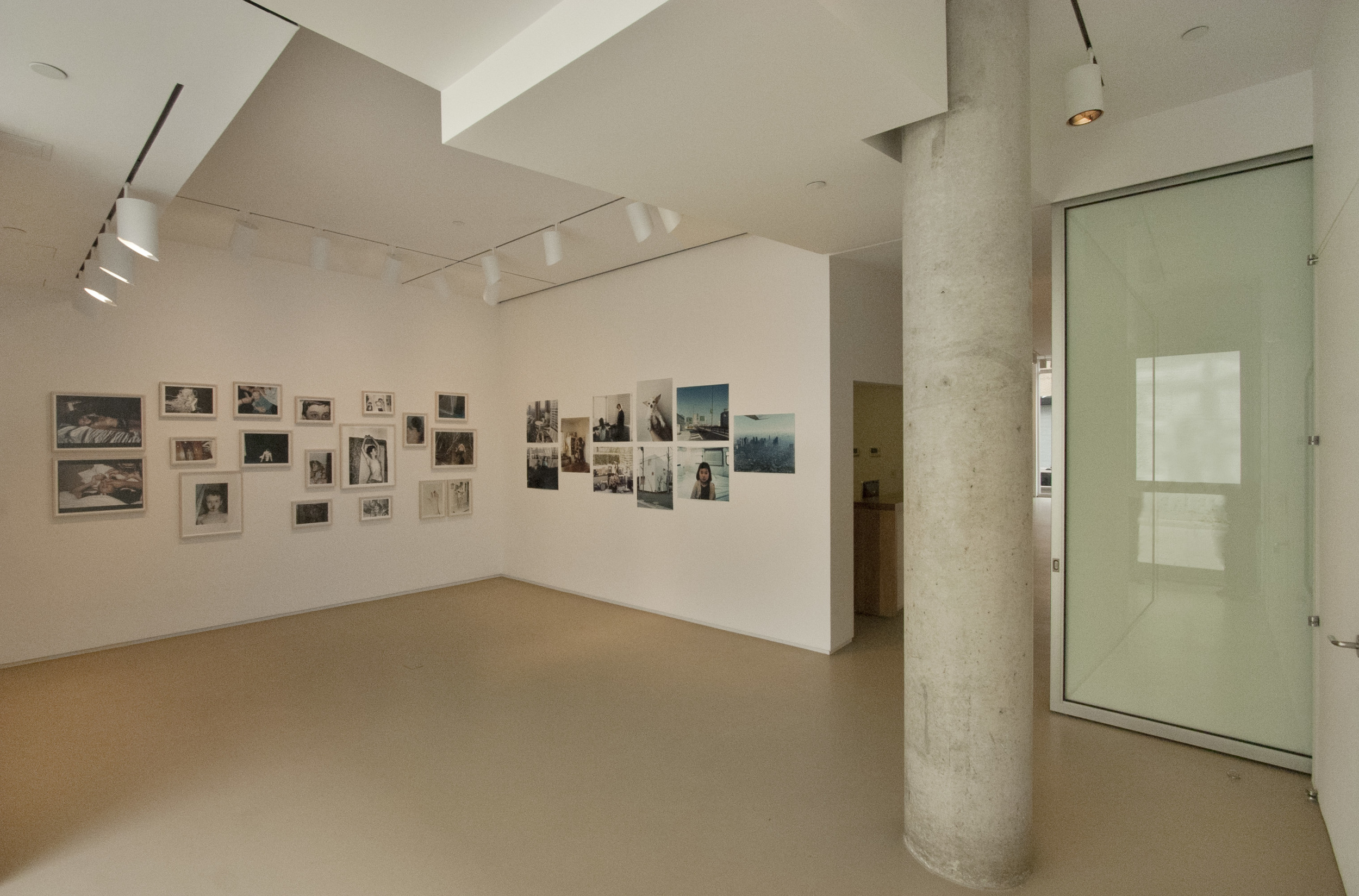
Main Gallery
This project for new exhibition spaces for internationally recognized Lombard Freid Projects gave the art gallery a new street level presence in the Chelsea art district in New York City.
The design maximizes exhibition space, allows for natural light and creates continuity with the street as well as integrates an outdoor courtyard / multi purpose space.
The gallery design balances the idea of a “white cube” while retaining the inherent qualities of the existing concrete building structure.

The gallery design balances the idea of a “white cube” while retaining the inherent qualities of the existing concrete building structure, which remains exposed and offset from the new intervention of the gallery space.

To emphasize the spatial connection to the courtyard and establish an organizing principle to the design, the Italian Renaissance technique of enhanced perspective was employed. An axial connection from the main gallery space through the project/video room to the rear courtyard space was established.

An eye level focal point was established on the exterior wall of the courtyard, which was used as the generator for the geometry in both plan & section of the spaces. All elements of the main gallery, reception desk, corridor and secondary gallery are controlled by this vanishing point. This is achieved through the sloping and canting of surfaces and in the subtlety of the lighting design.

The ceiling of the main exhibition space slopes up to meet the existing curtain wall maximizing the northern daylight.

The space was a core and shell fit out in a new residential building in the Chelsea art district in New York City. New entry steps with glass and metal railings were carefully designed to not detract from the main exhibit space.

The north facing storefront facade was not obscured in order to gain maximum street presence for the gallery and capture the northern sky daylight. In order to take full advantage of the existing tall glass facade, the gallery ceiling slopes up to meet the storefront framing system. Track lighting and linear air diffuser are integrated seamlessly.

The Reception wall and soffit along with the heavy timber countertop are canted to follow the organizing perspective lines established.
Lighting track and perimeter slot air diffusers meet and are carefully detailed to follow the geometry.


The Project Room design resolves it's geometry around a structural column and exterior doors to the courtyard. This animates the ceiling design.
The full height sliding frosted glass door demises the project room from the reception ans main gallery areas when needed.
The guiding perspective lines are etched on the frosted glass so that when the door is closed the perspective continues.

The project includes gallery offices, art registration and storage space.
Project: 3,000 net square feet including all mechanical, electrical and lighting.
Credits:
Project Team: Project Architect - Vu Tran
Lighting Design: Jim Conti Lighting Design, LLC
MEP/FP Engineering: Rodkin Cardinale PC, Consulting Engineers
Construction Management: Vanguard Construction and Development Co. Inc.


Main Gallery
This project for new exhibition spaces for internationally recognized Lombard Freid Projects gave the art gallery a new street level presence in the Chelsea art district in New York City.
The design maximizes exhibition space, allows for natural light and creates continuity with the street as well as integrates an outdoor courtyard / multi purpose space.
The gallery design balances the idea of a “white cube” while retaining the inherent qualities of the existing concrete building structure.
The gallery design balances the idea of a “white cube” while retaining the inherent qualities of the existing concrete building structure, which remains exposed and offset from the new intervention of the gallery space.
To emphasize the spatial connection to the courtyard and establish an organizing principle to the design, the Italian Renaissance technique of enhanced perspective was employed. An axial connection from the main gallery space through the project/video room to the rear courtyard space was established.
An eye level focal point was established on the exterior wall of the courtyard, which was used as the generator for the geometry in both plan & section of the spaces. All elements of the main gallery, reception desk, corridor and secondary gallery are controlled by this vanishing point. This is achieved through the sloping and canting of surfaces and in the subtlety of the lighting design.
The ceiling of the main exhibition space slopes up to meet the existing curtain wall maximizing the northern daylight.
The space was a core and shell fit out in a new residential building in the Chelsea art district in New York City. New entry steps with glass and metal railings were carefully designed to not detract from the main exhibit space.
The north facing storefront facade was not obscured in order to gain maximum street presence for the gallery and capture the northern sky daylight. In order to take full advantage of the existing tall glass facade, the gallery ceiling slopes up to meet the storefront framing system. Track lighting and linear air diffuser are integrated seamlessly.
The Reception wall and soffit along with the heavy timber countertop are canted to follow the organizing perspective lines established.
Lighting track and perimeter slot air diffusers meet and are carefully detailed to follow the geometry.
The Project Room design resolves it's geometry around a structural column and exterior doors to the courtyard. This animates the ceiling design.
The full height sliding frosted glass door demises the project room from the reception ans main gallery areas when needed.
The guiding perspective lines are etched on the frosted glass so that when the door is closed the perspective continues.
The project includes gallery offices, art registration and storage space.
Project: 3,000 net square feet including all mechanical, electrical and lighting.
Credits:
Project Team: Project Architect - Vu Tran
Lighting Design: Jim Conti Lighting Design, LLC
MEP/FP Engineering: Rodkin Cardinale PC, Consulting Engineers
Construction Management: Vanguard Construction and Development Co. Inc.